Tools don't provide value by themselves but tools may allow us, designers, to create value effectively.
Our job as Design Ops is to break the limitations that slow down PayFit from delivering a high quality solution to our customers. To do so, we act on a lot of touchpoints: from internal communication, to delivery processes and of course tools. One of these touchpoints alone is not enough to increase productivity and well-being at scale but together, they become really powerful.
So, which tool is best to support this combo? Knowing that designers eat, breath and sleep with Figma, the answer was obvious. We started here, extending our design tool of choice in 3 different ways to make designers even more efficient.
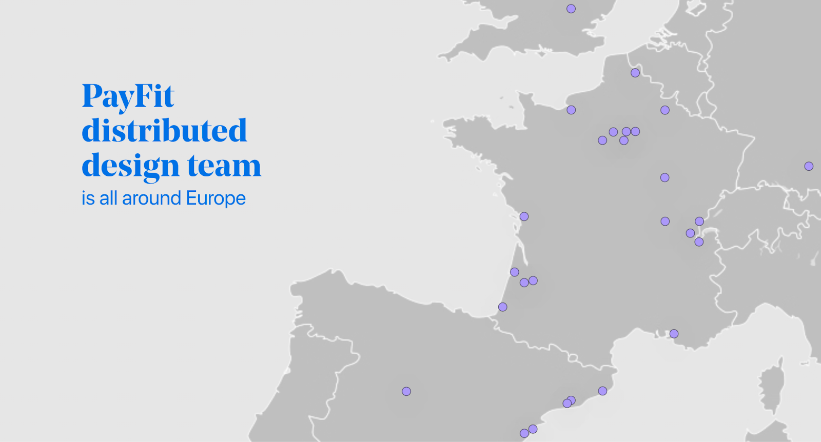
Meet a 30+ WFA design team and their challenges
Our design team has grown significantly during the last year and everyone is working from anywhere in Europe (WFA). While growing to 30+ people, some issues did appear overtime. We needed to fix these and prevent them from coming back.
With a bit of research and a few discussions, we identified multiple problems we needed to solve:
- Design files and delivery formats were not harmonized at all and each designer was working with their unique system. It puts the knowledge at risk in the long term while reducing communication efficiency throughout the organization. Without a common structure, each file opening requires too much brain juice to find the relevant information.
- Rituals were less engaging than before and team spirit has decreased while scaling the team. It implied low communication between tribes and less empathy between parallel projects. Communication was our core touchpoint here of course but a simple tool will help us not fall in the same trap again.
- Design system adoption measurement needed to be more accurate. The existing metrics slowed us down as we couldn’t be sure if the recent initiatives were positive or not. To speed up iterations and ensure viability, it was essential to be able to keep track of its adoption overtime.
With all of that in mind, it was time to find potential solutions in our design ops toolbox and get to work.

The “Extending Figma” unofficial trip
As we had never extended design tools before, some solutions didn’t come to our mind initially. Boundaries were unknown and exploration was required to start this adventure.
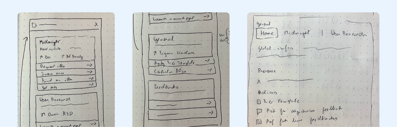
1. Building our first plugin to deploy file templates
To develop shared practices, we started to build new Figma organization guidelines, a new thumbnail component and at the heart of harmonization: a file template.
This one should allow efficient daily work and communication to bring value. But it also requires being easy to apply. With a good quick start solution, we can maintain recurrent use and ensure not coming back to our origin point.
Duplicating files, recreating page hierarchy manually or following a documentation rarely works at scale. And with the constraint of upgrading dozens of current working files with these methods, it will just not work at all. There were no native solutions; but we needed one.
Here came the plugin idea! Figma plugins use basic web frameworks (Html/Javascript or React), they have a simple API, this API is able to insert nodes in a file, adding plugins to a workspace is free and we can publish internal plugins. Looks perfect! We had the required skills in our team; the craft of our first plugin started…
To reduce our reliance on dev skills, we built most of the visual elements of our template directly in a dedicated Figma library called “Design helpers”. Then, with the plugin, we simply insert these components directly into the figma file at the right position. It allows us to quickly edit content and style of our template without editing the plugin at all. On the other side, the file structure of our template stays hard coded in the plugin. It reduces risks of unwanted breaks while staying relatively easy to update as this configuration is mostly text entries.
For this new product, as we should do for every product, we integrated Amplitude analytic events to understand its adoption and build future iterations on solid insights. We also added a content hub with links toward key resources available on Notion or internal tools. Still on an experimental path, the idea was to merge everything our designers need in the same place to increase adoption.
Finally, the tool was launched but the adoption was lower than expected. The hub idea didn’t find its public and the template button was welcomed but its use was often delayed until a better day. Yes, new practices even with a native solution doesn’t get adopted from one day to the other.
4 months after the release, at least 75% of PayFit designers have already used the plugin, 36% of our files use the template and the adoption is growing. Also, 100% of designers who did apply the template did use the plugin, not the template file they can duplicate. Tools are not enough by themselves but with some communication and iterations, they can become a great productivity companion.
Once this first experiment launched and some first successes were observed, it was time to fix some other unfixable issues with our Figma extensions…
2. Running and measuring rituals with FigJam
Rituals are the pedestal that allow us to build good team energy. To be successful, they require a well-balanced program, a high-quality animation and some collaborative interactions.
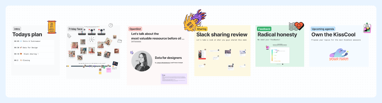
At first, we reorganized our rituals calendar around two main meetings :
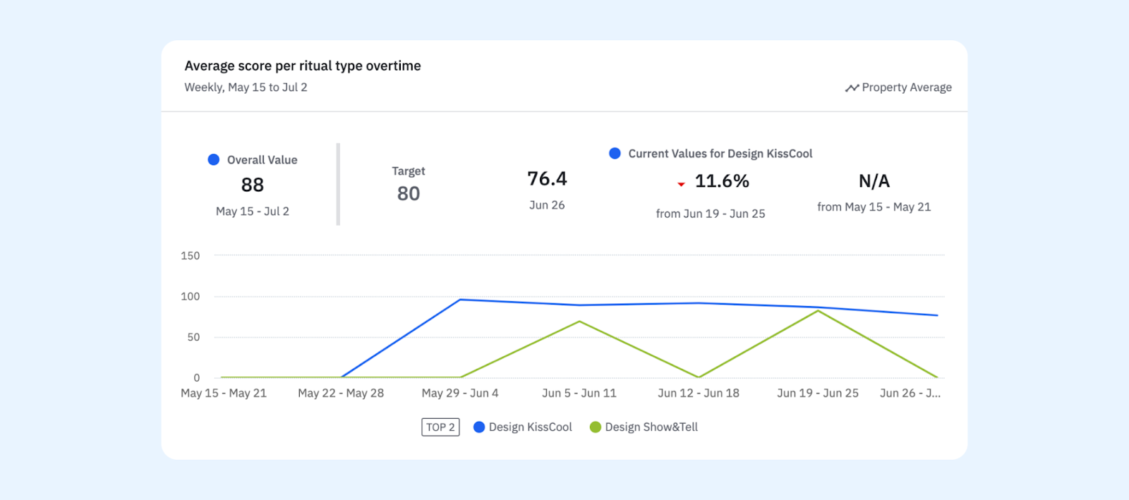
- The Show&Tell: a serious fortnightly meeting to get the latest news and the latest design updates at PayFit.
- The KissCool: a chill meeting every friday with many interactions while learning new things from our peers or external people.
Both get a straightforward program with an interactive starter, a clear main slot program and an end where we collect feedback and ideas for the next sessions. To increase collaboration and the sense of community, each meeting runs on FigJam where we add photos, stickers and reactions during the meeting.
This revamp done, everything now looks and feels better during meetings. But how can we measure it? And mainly, how can we ensure to maintain the quality of these sessions?
From the beginning, we did use a static scale image to get sticker feedbacks at the end of each meeting. However, this data was lost every week and we weren’t able to get a proper view of the trend. But what if this same scale could capture the data for real? Here came a new FigJam extension at the rescue: our “Radically honest immediate feedback” widget!
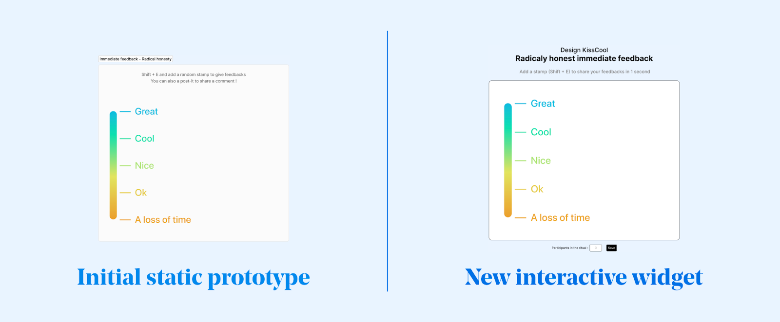
This widget uses the exact same scale image but captures the sticker event and sends it directly to Amplitude, our data analytics platform of choice. Amplitude is not designed for such use but we know how to use it, it answers our needs properly and every designer knows how to read data in it. Here the best tool was the one we already knew. Finally, just using a bit of javascript and our existing toolstack, we were able to keep a native and fun experience for our designers while collecting proper feedback overtime.
3. Measuring design system adoption and more with a custom script
Design system is long term work, it’s both a harmonization tool and a communication tool. Badly adopted by both designers and developers, a design system can cost a lot of money without bringing much value to users. In the opposite case, well adopted by everyone, it can be highly rewarding for both the company and the users. But how to know in which scenario we were?The design system measurement issue was in a deadlock until our design system lead shared with us an article about how Pinterest measures its design system adoption.
Now well trained in extending Figma, we decided to dive into the topic as a side experiment at first. Part of the Pinterest calculation code was available online, it was enough to start exploring the tool on our internal files.
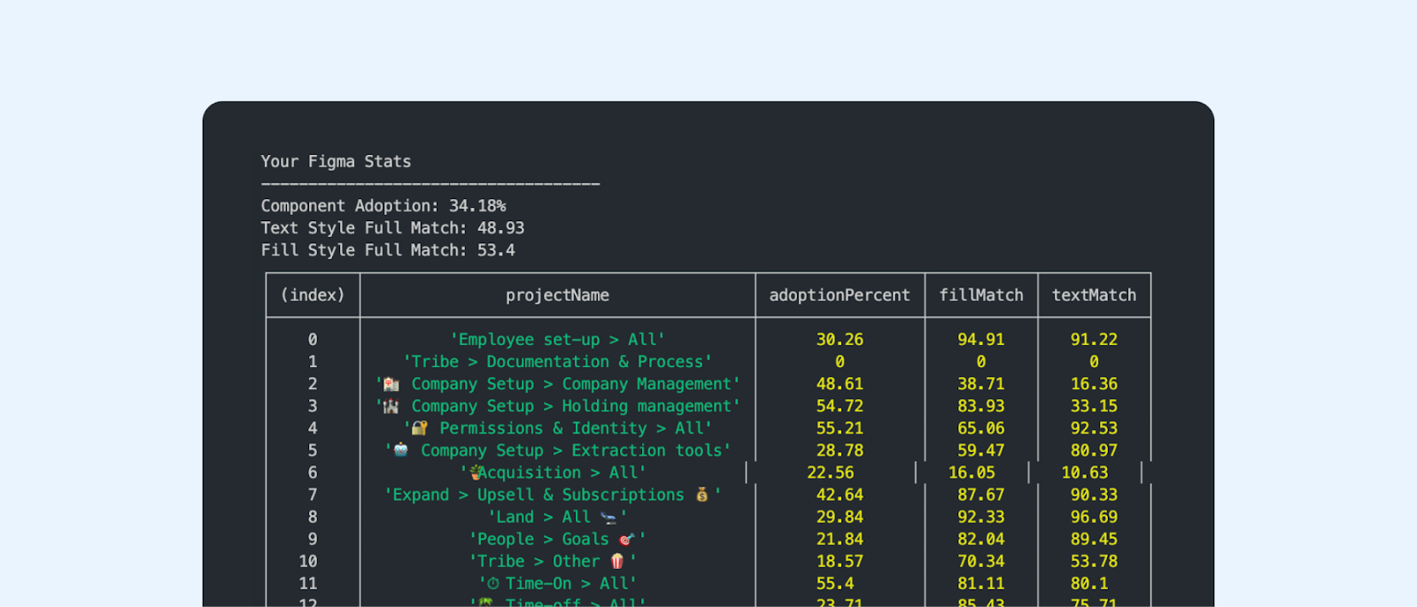
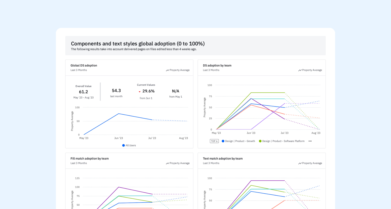
The first results were a bit raw as we analyzed every single page of every single file. But thanks to our file template, we were able to detect the pages delivered to the engineers. These pages represented design system adoption with a way better accuracy. A few other tweaks later, we were even able to split the results by project, by tribe or even by squad!
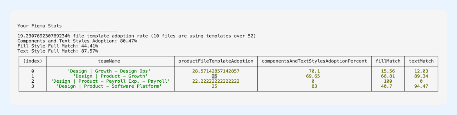
Great start! But as for every measure, a single point in time with no comparison is pretty uninteresting. That’s when we called back our favorite friend: Amplitude. Again, with our hacker mindset, we sent well formatted data as an analytic event and displayed it in a simple and clear dashboard that everyone can access and manipulate. A hacky house for statistics but one that fills our requirements pretty well.
Our takeaways about extending tools as an efficiency boost
For sure, as Design Ops, we can make our company earn time and money by overpassing our tool limits. It’s not what will make your team more efficient by itself but these add-ons help core initiatives become more sustainable.
If you are going to follow this path too, keep in mind that:
- Most of the time, basic coding skills are enough; so try by yourself.
- Most of the time, a solution already exists; don’t reinvent the wheel for nothing.
- Each new tool built costs time, will require maintenance and creates a new learning curve for the users; make sure to ensure viability.
That’s why it’s key to make sure there is no existing solution before starting such a project. Then, we should build future-proof solutions by reducing code configuration and maintenance actions. This will reduce the chance of the tool being abandoned and the time spent on it lost.
In the end, adoption is key. Each initiative requires a lot of care in order to become fully adopted by the teams, and finally become long lasting. Each project requires unique solutions to drive change, and yes, tool extensions can be part of it.
PayFit design team is always looking for new talents. Senior or apprentice, there are a lot of challenges and learnings waiting for you in our team. If you want to help us shape the future of work, give a look at our open positions.


