Illustration falls within the domain of art. As a result, it’s often considered in a subjective way.
Why am I telling you this? Because when talking about choosing PayFit’s illustrative identity, we are not just changing a frame in our living room, but the face of our company.
Therefore, it was important that our illustrative style appeal to those who don't know PayFit as much as we do. We needed to be truly objective in our choices.
Proper research was necessary to help us give direction to our illustrations. We needed it in order to create a renewed visual identity for our company, before we even knew how illustrations would look.
I’m going to tell you all the steps we have gone through in the creation of these illustrations. I’m also going to share my personal advice in this adventure.
We proceeded in four steps: discovery, definition, design, and delivery. You might know these steps as “the Double Diamond”.
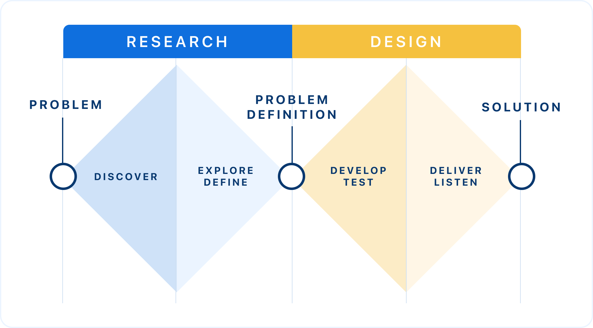
At PayFit, we rely heavily on the Double Diamond design process. It allows us to stay on track in our projects.
We wanted to search for multiple data that we could match together, so that we could have several directions of research. Then, we would reduce these tracks so that we could obtain the ideal solution.
The discovery
In this preliminary step, we have three sub-steps :
- Examining things as they stand
- Collecting data
- Analysing the data
1️⃣ First step: Observing the current state of affairs
If you want to change your company’s identity, it’s because the existing one is not quite perfect. Otherwise, there is no point in changing it if everything is working. To be sure, what better way than to ask potential customer?
We therefore spent time collecting feedback during a guerrilla test session (thanks Julien Bouvier and Mathilde Gauthier for handling these tests).
When collecting opinions, remember that like all emotions, they are subjective.
“No striking visual elements.”
– Jacques, 55, retailer and leather specialist
"Illustrations make me think of the subway system. There's only two colors on your website."
– Théo, 25, student /entrepreneur.
Don't get lost in these opinions: every illustration is received differently by the person who sees it.
But behind this, we must not respond to a desire for admiration for the artistic work accomplished. These illustrations must meet a business need. They must correspond to our target, which is an SME for PayFit.
2️⃣ Second step: Collecting datas
Here is a non-exhaustive list of what you can collect and use:
- A list of your competitors: direct or not, everyone that is in your business field. It allows you to place yourself in the market.
- Your company’s design principles: these principles are essential to make sure that your graphic style matches with the rules established by your colleagues and managers.
- The companies that inspire you: They may be outside of your business field, but you find their ideas stimulating.
This is real teamwork with the Marketing & Branding teams. You will need to be cross-domain to collect proper data that will help you.
3️⃣ Third step: Analysing everything
When all this work is done, you can sort the collected feedback into one or several analysis boards with precise objectives.
For our own needs and context, we chose to focus on:
- How could we be different from our competitors, in terms of colours and representations?
- What style would allow for quick execution and high impact to maximise the benefit/cost of these new illustrations?
We can thus discuss the influences, inspirations and overall ideas. This is an important part of coming up with a unique style that fits the perspective of everyone involved, and is correctly informed from the collected resources.
Write everything down, because a compelling idea is not going to spring up right away, or even in a single workshop.
For example, one of our early observations was:
"The illustrations of our competitors presents humans in action, and often show the product. A good idea would be to turn to illustrations that are a mix between human and abstract in order to stand out, using the brand colours to not fundamentally deviate from what is being done today."
Graphic choices are influenced by business needs: we need to stand out without standing out completely for fear of losing our target with a design that doesn't represent them.
My advice: if you want to be faster, prepare each illustration with the name of your inspiration (if any). It is then easier to place them on each board.
The definition
Once the Discovery step is done, we can move on to the Definition step. Here, we are going to refine our research in order to define the style of illustration for PayFit.
1️⃣ First: Testing the leads and selecting “the chosen one”
Thanks to our research, we picked the most fitting illustrations. We selected them because they were the closest to PayFit, in style and through the message they reflected.
Once we made this choice, we had to find the illustrators that fit the rendering. We decided to go with someone from outside the company because at the time, we didn't have enough internal illustration subjects to make up a permanent team member on that topic.
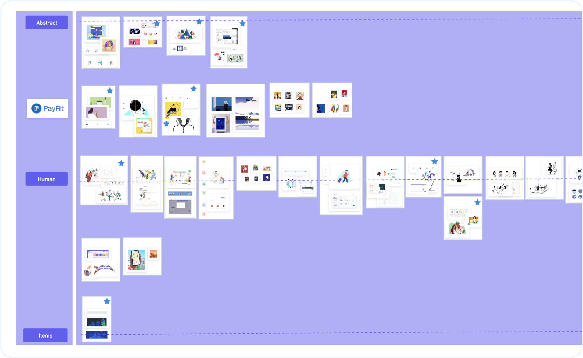
For this major project, we selected 8 illustrators. You can of course choose more, depending on the project.
Using Figma, we created one board for each illustrator with tags that contain the design principles. Each designer had their own colour. Then, they could mark each board with the design principles that suited best.
I added 3 simple rules on top of the design principles to ensure that we remain objective. They weren’t chosen randomly: they matched the strategy of PayFit.
These rules are: The design...
- ... facilitates the understanding of a message that can sometimes be complex (payroll area).
- ... inspires trust: styles that are too youth-centric could have the opposite effect for our target demographic.
- ... is graphically light.
2️⃣ Second: Cleaning up the result
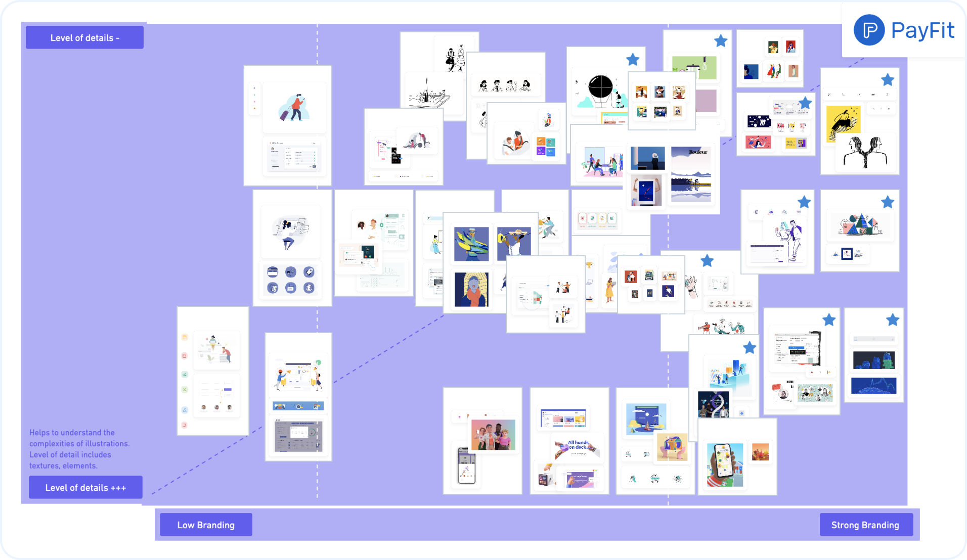
For a complete definition of the PayFit illustrative style, we created a diagram that defines our design depending on the competitors. It allows us to see the differences and the similarities within the app, the website and the Help Center.
This diagram is meant to evolve depending on the various research studies that will feed our thinking.
Creation and iteration
With this diagram in hand, we decided to hire a freelance illustrator: Valentin Galmand. He would help us move forward on the illustrations for the site, the Help Center and the application. He allowed us to transcribe all our searches visually.
An opportunity to test our illustrative style came very quickly thanks to our new feature, the 1:1 feature that was going to be released in Beta for some customers.
We did encounter a few unexpected issues. For instance, we didn't fully take into account the technical aspect of creating illustrations in our Discovery step. Namely: working in Figma with both textures and animations.
Let that be a reminder to us all, my friends! Discoveries are never meant to be idealistic or theoretical: you need to ground them in the harsh realities and think Delivery already. A "feasibility study" on the requested style should always be conducted before the Design phase.
The difficulty in our creation process was that we wanted vector graphics, with a minimum of texture. But we realised that the combination of texture and vector shapes in Figma, with animation to boot, was impossible.
After two weeks of export testing and with Valentin’s help, we found a solution – a compromise that allowed us to finalise the identity of PayFit: we dropped the texture altogether!

Conclusion
These days, illustrations are an ongoing project, in order to feed our image bank in accordance with the image of PayFit and the new markets we open.
The team has since been joined by Fiona, who handles the in-house illustrations. This allows us to separate the different subjects, and this organisation works well.
Indeed, we now have more illustrations, which is beneficial for the product. We quickly realised the importance of creating a unity between the brand and the product.
But the work is never finished and the team keeps bringing more content to our illustration library and making good progress on it. Now that all this work on the style has been done, we must continue to produce illustrations – or have them made by external people, depending on internal bandwidth.
All this is the result of true teamwork with the different departments within PayFit. From the beginning, the strategy, marketing, and branding teams worked together to start the project.
It was necessary to have everyone on board to create an illustrative style that suits our target. This work has given rise to new graphic questions to be addressed in the near future. For instance, the problem of empty states, a subject about which we are sensitive… but this is a discussion for another time.


